The Challenge
Etiqa is a full stack development and QA company with its headquarters in Turin, Italy. The company has grown over the years and it needed a complete makeover of their brand.
Our Solution
After a couple of interviews with the founders of Etiqa, we captured their vision of the company, the type of a business it represents, the team behind and the vision of future Etiqa. The company's recent expansion overseas into the US and its international client base required identity, which could be instantly and clearly understood in any country.
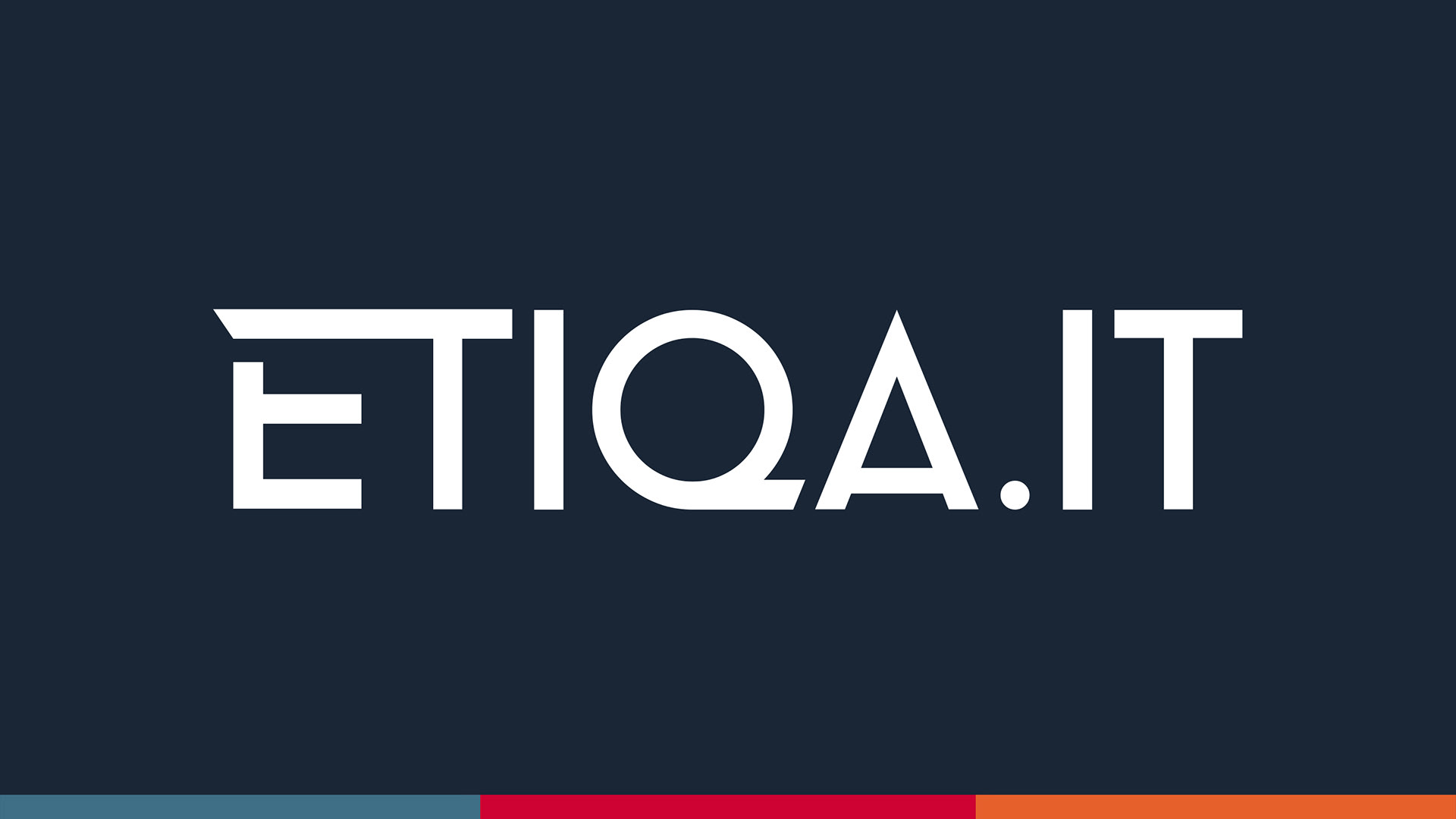
The founders have also requested to make a strong visual emphasis on the abbreviation ‘QA’ (for quality assurance) and to include their domain name extension ‘.IT’ into the logo (.IT stands for Italy and Information Technology). Etiqa had a strong faith in the unique capabilities of their bespoke QA product and was proud of the company’s Italian roots.
We had a few iterations of the brand requirements. We looked into variations of the logo, fonts and the colour palette. In the space of a few weeks Etiqa had a new brand. The package included the guidelines and the artwork with the Logo, Typography for print and responsive web, Colour Palette, Photography and Illustration.
Skills Used
Branding, Product Design, CX and Art Direction
The Result
The client was happy with the new identity. Upon completion of the brand makeover we progressed towards the next project - the company website redesign.